State
Mobile app • 2022
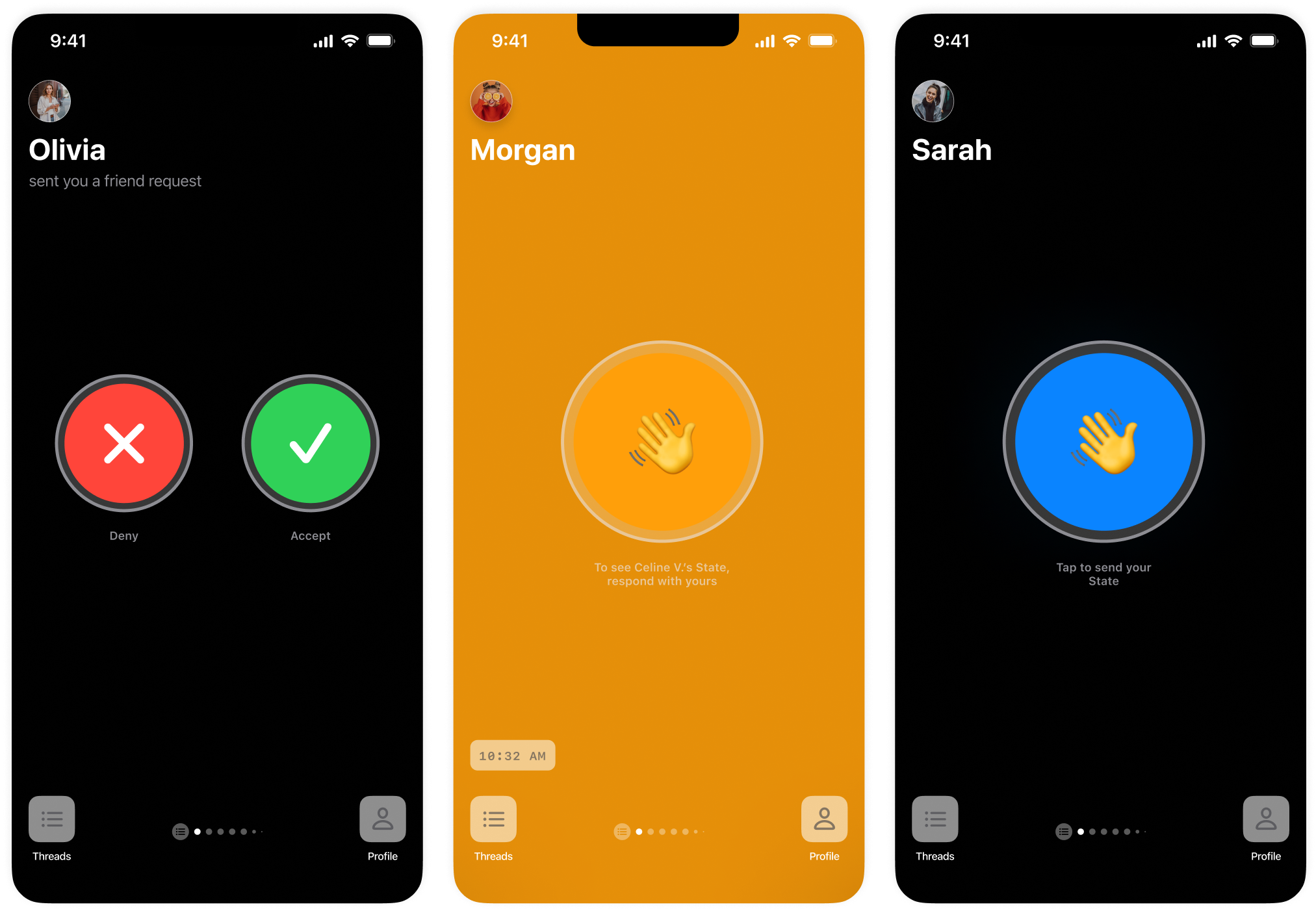
I designed and developed an iOS application called State, a product made to help people stay in touch with each other. On top of designing the entire interface, I programmed both the frontend and backend.
Background
The idea for this application came to me when I wanted a fun way to keep in touch with my partner over long distance. I wanted something that felt personal and captured the joy of being close to another person.
When I dug deeper into what it meant to feel close to someone else, I thought about person-to-person interactions, and how people who are close interact differently than those that are not. In looking at my relationship with my partner, and thinking about our interactions and how they would make me feel, I thought about how we frequently message each other just to see what the other is up to in that moment. The candid, informal nature of these everyday conversations, however banal they would seem, were a symptom of our closeness as they were opportunities to be ourselves, without any pretense, expectation, or agenda. I would feel so happy when we had these checkins, with her asking me what I was up to and I inquiring back, as they reminded me that someone else was thinking about me and allowed me to feel like a part of her life. To me, it was this interaction that captured the feeling of being close to someone.
So, I wanted to make a product based off of this interaction of candidly sharing what you’re up to with someone.
Concept
The concept, intended as a mobile application, is centered around sending your State, a message composed of a picture from the front-facing camera and a picture from the rear-facing camera, to a friend. Upon receiving your State, your friend will be notified of your having sent them your State, but they will not be able to see its contents until they send you their State. Likewise, you cannot see your friend’s State until you send another State of your own. If either party does not respond to a State received from the other within 24 hours of it being received, then the receiving party will never see the State’s contents.
Additionally, when recording a State, you have a time limit on how long you have to take the pictures. If you run out of time, the app just takes the photos automatically. You can also set a timer on the recipient, meaning that you can dictate how long the receiving party has to record their State in order to see yours. The reasoning for this is that States are meant to be candid—they are supposed to represent an unfiltered perspective of you at a single moment in time.
It should be noted that the intention of this design was to be used solely for sending what you’re up to to another person, not for having linear, back and forth conversations.
Thread States
The interface is centered around the interaction between two users, referred to as a Thread.
A Thread is always in one of five mutually exclusive phases, where each phase transitions from one to the next depending on a State message being sent or received.
To enforce the mental model of a Thread having precise phases, each phase is defined by a particular color.
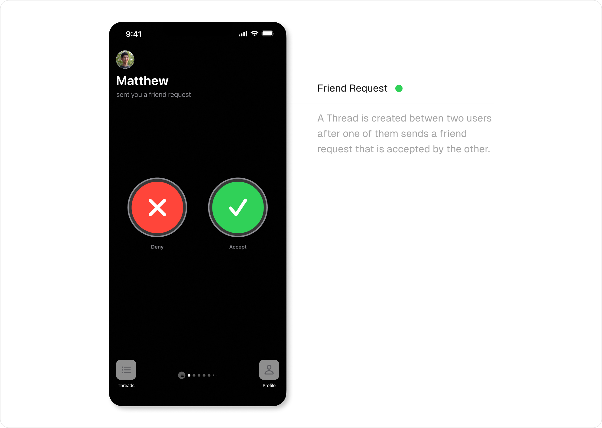
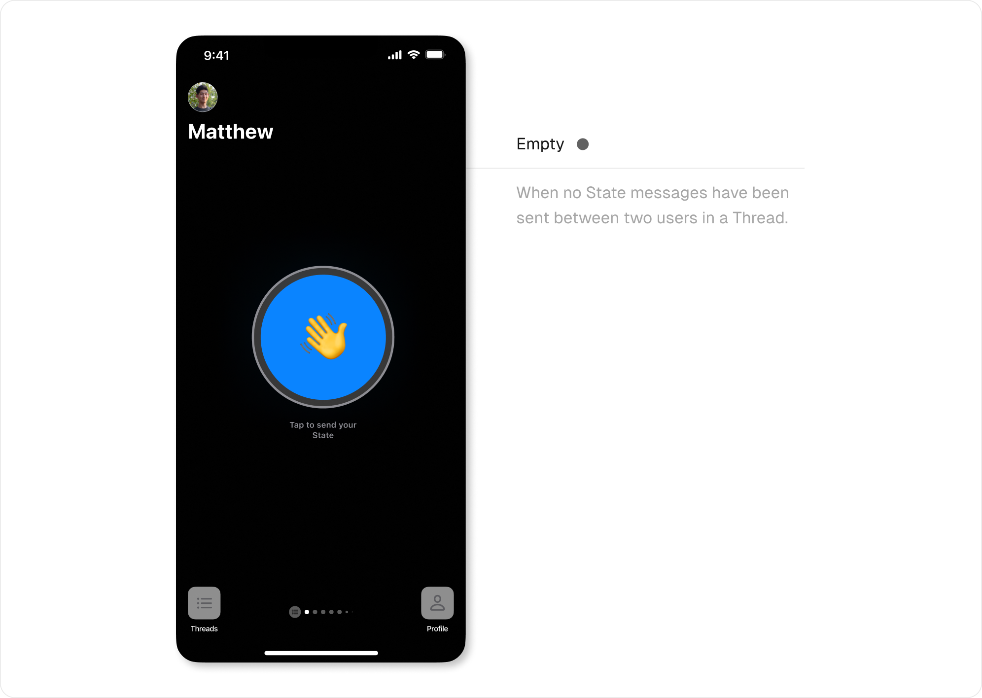
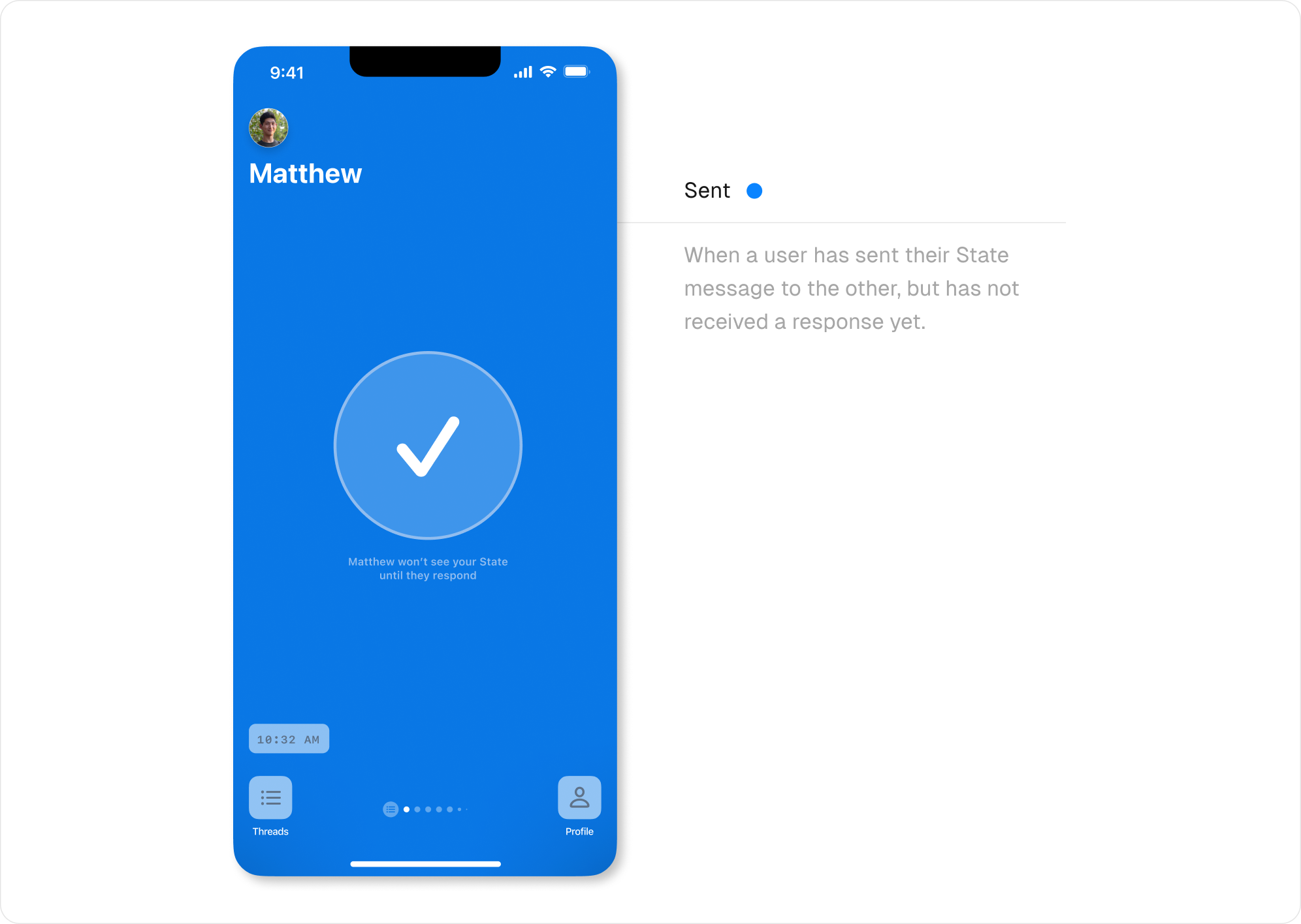
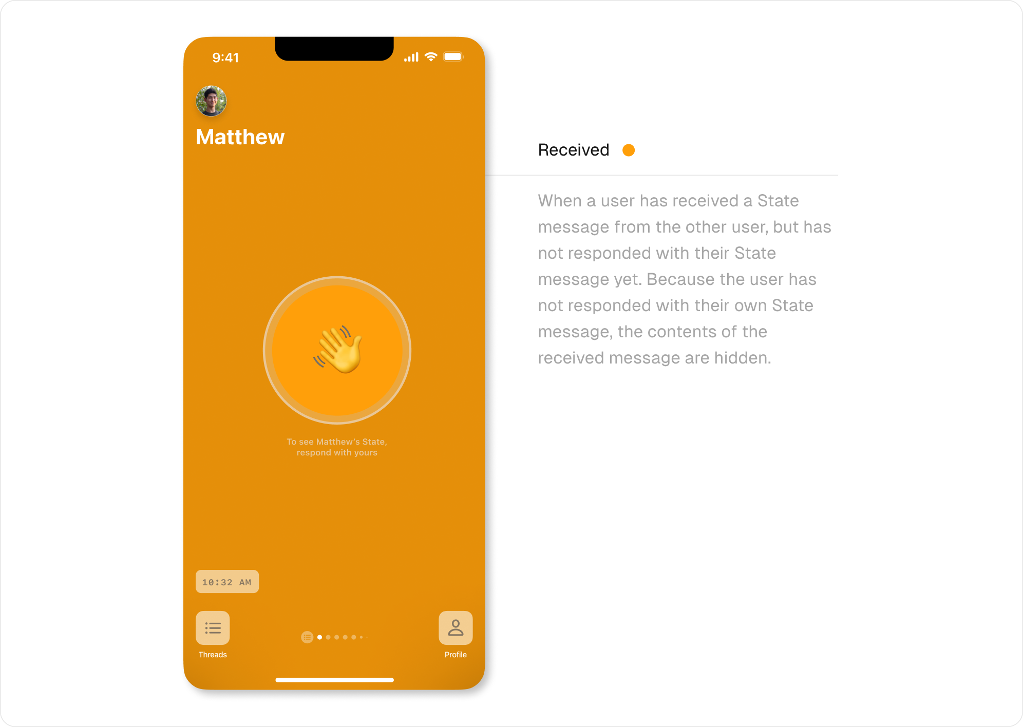
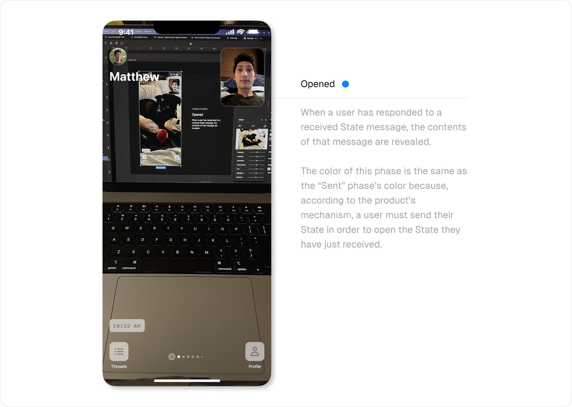
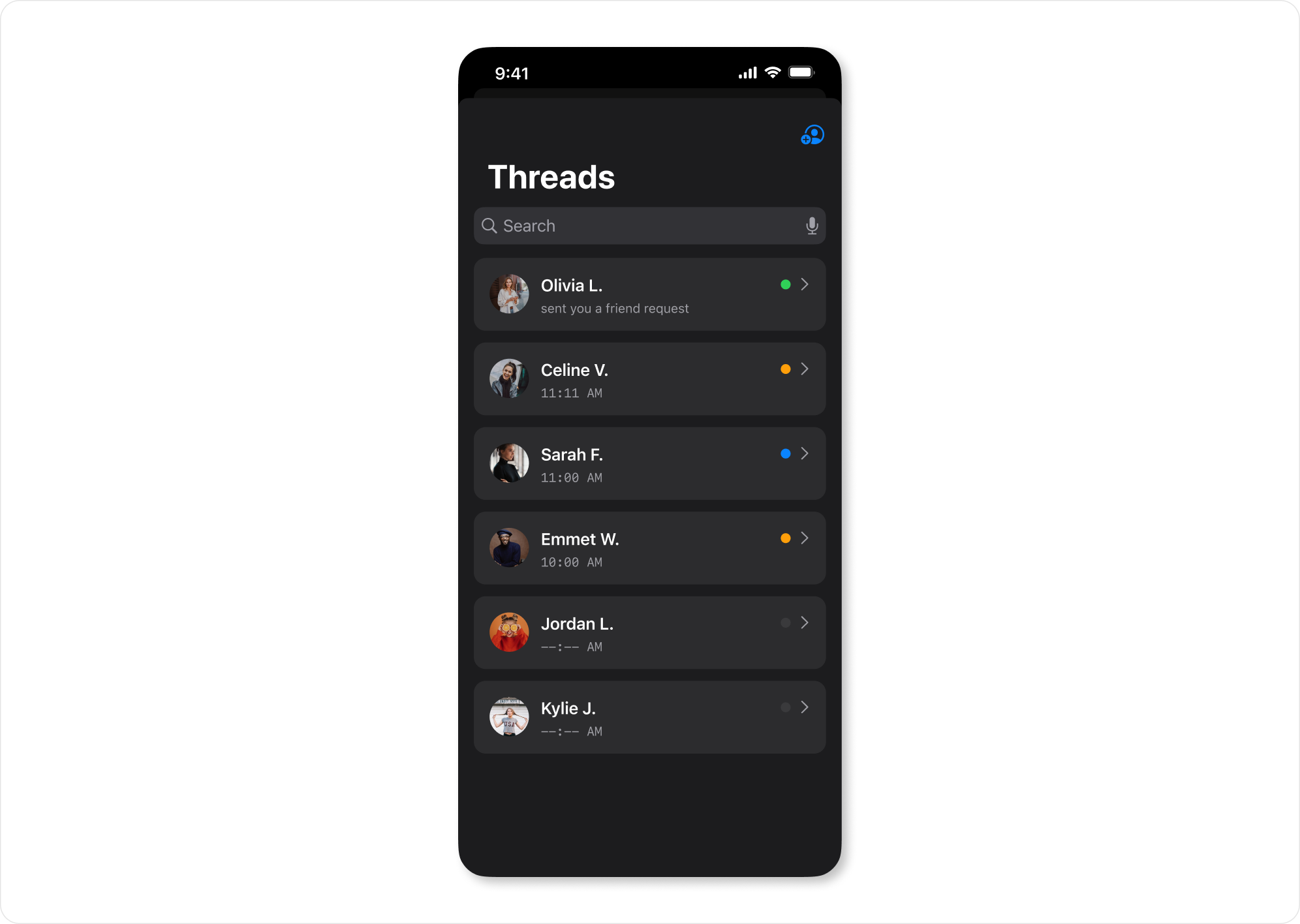
The color feedback is enforced in the Threads Overview screen, where each Thread tile has a colored dot denoting the phase the Thread is currently in.
App Icon
I designed my first app icon for this project. I wanted something that was built from simple shapes like circles and rectangles yet had a strong connection to the qualities that made the product unique.
I first started playing with the concept of time, as a key aspect of the product was having a time limit on how long a user had to take their photos.
![]()
After playing with a few variations of this, I felt that the notion of a clock implied the product was a timer of some sort. Additionally, while the time limit aspect of the product was important, I realized it was more of a secondary detail.
I then tried playing off the name of the product, State.
![]()
While I enjoyed the simplicity of this, it just felt too boring.
I came back to the idea of working from a key characteristic of the product. I tried employing a chat bubble motif, as is often seen in instant messaging icons, in a different way as the product had messenger qualities.
![]()
The final version was the following:
![]()
Development
In addition to all of the interface and interaction design, I programmed the entire application.
I wrote the mobile client as a native iOS application using the Swift programming language. I employed the functionally-oriented Composable Architecture library to write and architect the business logic and used the UI framework, SwiftUI, to build the entire user interface.
I built the application’s primary server-side API application in Swift as well, which I decided to do to minimize context switching as I worked on the mobile client and server-side application simultaneously.
As the application required realtime exchange of messages between users, I also had to build out some realtime infrastructure using the bi-directional WebSockets protocol. For this, I developed a high-performance realtime API server using the Rust programming language.