Everyware
Reusable Dinnerware • 2019
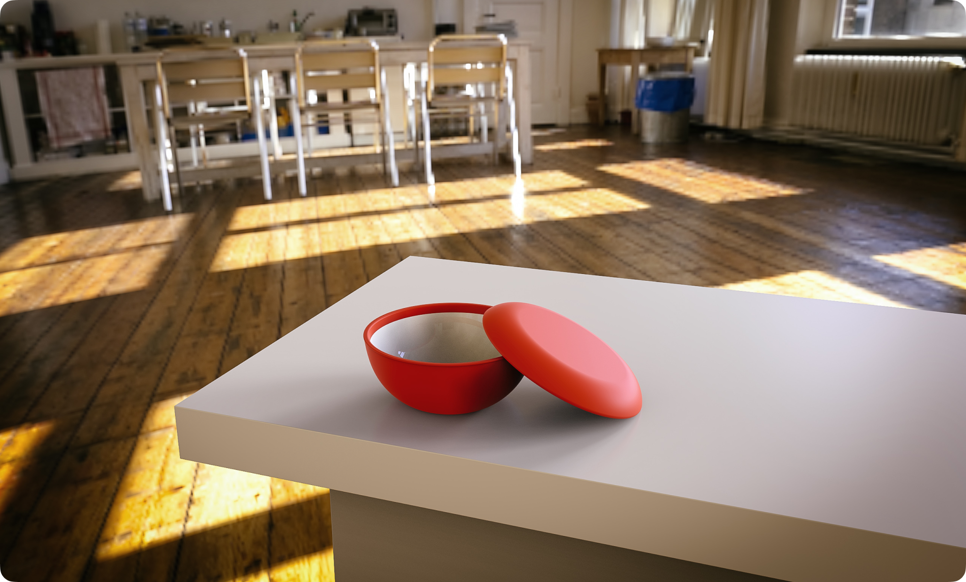
I co-founded a direct-to-consumer startup called Abioco that designed a hybrid dinnerware/container product, called Everyware, that was durable, eco-friendly, and reusable. In addition to co-founding the company, I led the product’s design and development.
Background
Disposable, single-use food containers are harmful for the planet as they are extremely resource-consumptive for something that has a minuscule lifetime. While many of these products these days are purported to be bio-degradable, the hidden fact is that their bio-degradability is contingent upon specific disposal processes only possible at specialized facilities. This implies that even bio-degradable products consume lots of energy during their lifetime and because they require special disposal, many don’t even get processed correctly and instead end up in landfills like regular trash.
But we are in a world where these single-use containers are increasingly prolific. With the advent of fast-casual dining and the proliferation of food delivery apps, people consume so many single-use containers. Whether it’s getting a salad at your local Sweetgreen or getting a bowl of noodles delivered to your door, single-use containers are part of all of it.
How do we fix this? While we could try to continually minimize the resource consumption of the single-use product lifecycle, we will always be fighting an uphill battle as the very nature of single-use necessitates large-scale, continual production which inherently uses up a lot of energy and resources.
Thus, it seems that the best way to address this problem is to reuse more. But what is there for us to reuse when it comes to on-the-go dining, an area where single-use containers are used heavily? When I was looking into this question before starting Abioco, it turned out there wasn’t much outside of your typical Tupperware-like products, which were ill-suited for the modern world of fast-causal, takeout-heavy dining as they were clunky and usually displeasing to eat out of. In particular, since many people eat directly out of the containers in which they receive their food in on-the-go contexts, the inconvenient, awkward shapes of existing Tupperware-like products made it difficult for both restaurants trying to serve their fare with them as well as diners trying to eat from them.
This formed the motivation behind my co-founding of Abioco and the design of our primary product. Specifically, we aimed to make a reusable food container that was portable and convenient, yet felt great to eat out of, with the end goal being to create a dining world less reliant on single-use containers.
Functional Goals
To make a product tailored to a style of dining characterized by fast-casual, takeout and delivery contexts, we felt that the design needed to:

The first goal, having a form close to proper dinnerware, was particularly important with regards to the product’s resulting form for two reasons. First, we wanted people to feel like our product was made to be eaten out of. We felt that too many of the existing container designs were either too box- or tray-like and didn’t feel like they were made to help you enjoy your food. Second, we thought that by sticking close in form to regular dinnerware, restaurants using our product would like that their fare could be enjoyed not out of a box, but out of something that was more dinnerware-like regardless of whether or not people dined-in or did takeout/delivery.
The Design
In leading the product’s design and development, I wanted to start with figuring out what the product’s essential form would be.
As our first two primary goals were to mimic the feeling of dinnerware and function as portable storage, I started with examining if, and how, we could make regular dinnerware into portable storage while keeping the inherent forms as intact as possible.
To do this, I took a first principles-style approach in which I examined the component forms of prototypical food storage containers. First, I saw that the primary, body component in which storage contents are held almost always comes in either a hemispheric (bowl-like) or rectangular (tray- or box-like) shape. Second, I noticed that the top component, the lid, is always a relatively flat circle or rectangle depending on the shape of the body. While these observations are seemingly tautological, they led me to observe that both essential forms have direct analogues to shapes found in standard dinnerware. Specifically, container bodies are analogous to bowls and container lids are analogous to plates. With this, I wanted to explore if we could design a bowl and plate pair that could form a container through the plate performing double-duty as a lid.
What was particularly exciting about this realization was the potential for versatility, which was the third goal of ours. Particularly, in a single container unit, having both a bowl and plate together would be extremely versatile to both serve and eat many different kinds of foods.
Now, while in concept we could just make a plate that could act as a lid for the bowl, we weren’t sure if we would have to compromise on either the plate’s or bowl’s form to make container formation possible. We wanted to avoid compromises in each component’s form as much as possible because we wanted the product to maintain its tight relationship with regular dinnerware.
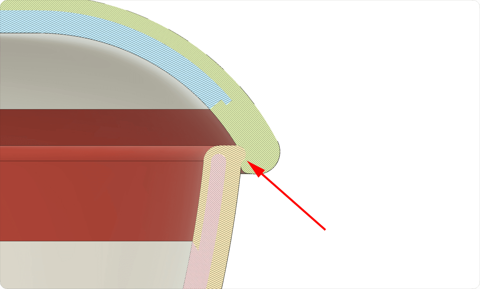
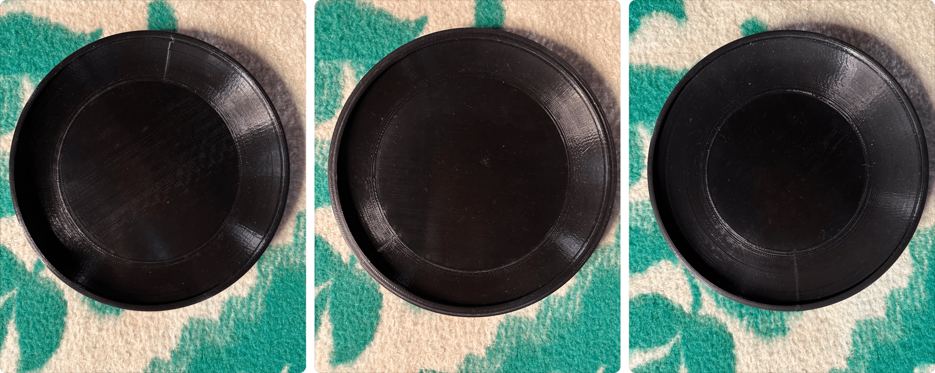
I approached this issue through examining various takeout container designs and started experimenting with a lock-and-key style fit which involved placing a small lip on the rim of the bowl that snapped into a slot inside the rim of the plate. We tested this mechanism through 3D prototyping with the help of a small design studio that had 3D printing machines. After a couple prototypes, we felt confident that this mechanism would adequately keep the pieces together when attached. We were happy with this minimal mechanism as it didn’t require nearly any modifications to the primary forms of either component.
Aesthetic Impact
I also put heavy consideration into the aesthetic effect I wanted our product to have. It wasn’t enough for it to just be functionally competent in regards to reusability and portability—it needed to have an impact on the person using it and those who saw it if we wanted to truly entice consumers enough for them to deal with carrying an extra item around on their person.
In looking at companies like HydroFlask and S’Well, I saw that they helped popularize the mass adoption of reusable water bottles through making bottles into young, exciting products that enabled people to express themselves through qualities like color choice. People didn’t just buy the HydroFlasks and S’Wells because they were useful and better for the environment, they bought them because they made a statement about the person using it, which in turn made more people use reusable water bottles in general.
The success of these brands inspired me to intentionally employ certain design elements that would enable the product to make a statement about its owner, with the end-goal being not only to make something aesthetically attractive, but to encourage a trendiness that would support our overall mission of having people use reusable containers more generally.
Colors
Specifically, I wanted the design to easily support many colors. Silicone, a durable food safe material, can be easily dyed with lots of different colors which can stay vibrant through its lifetime. While the product’s entire body couldn’t be made out of it, I wanted to see if there was a way we could leverage Silicone somehow to employ color variation in our product. I decided to use a thin Silicone wrap around both the top and bottom components because that way the hard plastic surface would still be exposed for eating but the colorful shell would be bold and exposed whether the bowl and plate were used separately or put together as a container.
In looking at companies like HydroFlask and S’Well, I saw that they helped popularize the mass adoption of reusable water bottles through making bottles into young, exciting products that enabled people to express themselves through qualities like color choice. People didn’t just buy the HydroFlasks and S’Wells because they were useful and better for the environment, they bought them because they made a statement about the person using it, which in turn made more people use reusable water bottles in general.
The success of these brands inspired me to intentionally employ certain design elements that would enable the product to make a statement about its owner, with the end-goal being not only to make something aesthetically attractive, but to encourage a trendiness that would support our overall mission of having people use reusable containers more generally.

Bottom Silhouette
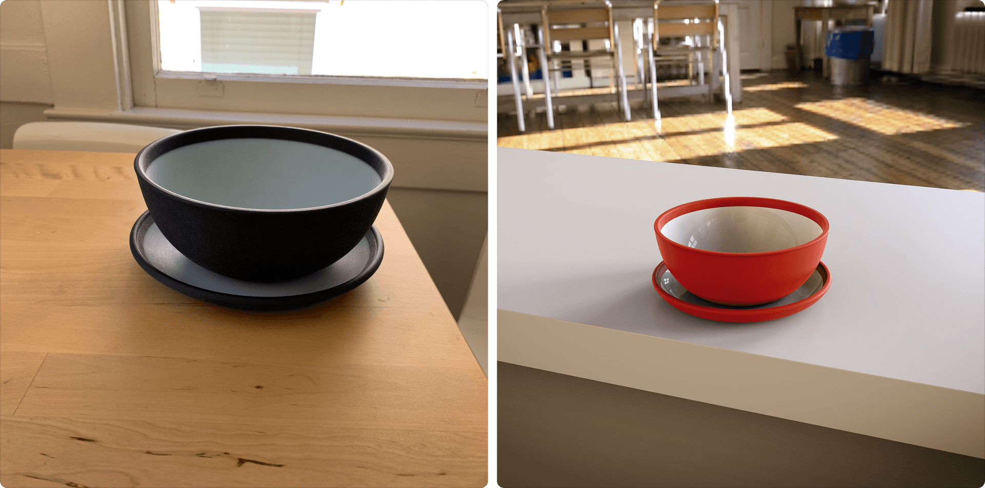
To accomplish this, I first started with the bottom, bowl component and researched various bowl shapes. Knowing that our product was meant to be versatile for many types of food, I decided to stay away from low-sided styles. We experimented with various shapes through many 3D prototypes as we tried to find something that felt good to hold and stood strong in profile.
After a few variations, I settled on a more or less classic “cereal bowl” shape. The moderately high sides and wide opening gave the strong, independent form I wanted while keeping the intended versatility.

Top Silhouette
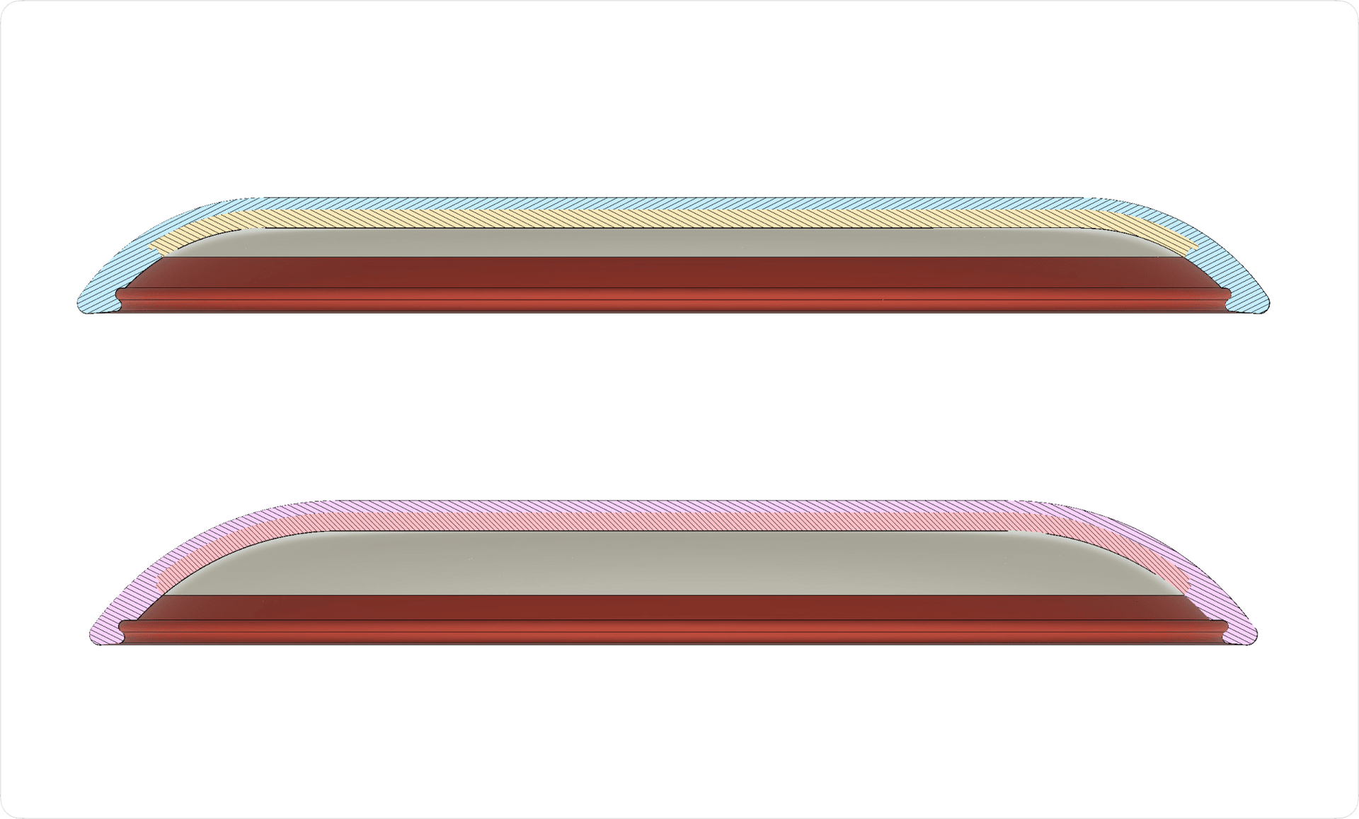
In regards to the top, plate component, to achieve a silhouette that worked independently both as a plate and a lid, I decided to exploit the fact that plates often have some sort of slope just on the inside of the rim. I exaggerated this curvature to a greater extent than what you might find on most plates which ended up benefitting both the plate and lid roles in terms of silhouette. As a lid, the curvature complemented the bowl’s lines when forming a closed container, while as a plate the curvature contributed to a more distinct profile when sitting on a flat table top. As a bonus, this exaggeration of slope had the added benefit of becoming a convenient place to hide the lid locking mechanism as well.
Beyond the Design
While the product’s design was a significant effort, it was only one piece of the puzzle. As a business is more than just designing something, as a co-founder I also worked with manufacturing engineers, built out the e-commerce storefront, wrote the script for a product marketing video, and developed some social media marketing campaigns.
Collaborators
While my co-founder and I did much of the work behind Abioco ourselves, we did have multiple collaborators through our journey.
First, we collaborated with a small, Los Angeles-based design studio, BRCHN Design House, which had deep experience in industrial design and manufacturing. They consulted on the product’s design, particularly with refining how the design could be ready for manufacturing as quickly as possible. Additionally, BRCHN helped produce many of our 3D prototypes as they had all the necessary software and equipment.
When it came to manufacturing, we worked with engineers at Racer Manufacturing, a Singapore-based contract manufacturer. Specifically, I collaborated with their team on the product’s molds and material sourcing.
We also worked with a San Francisco-based media company, Rickhouse Media, to produce a product marketing video. For this, I developed the script and worked with one of Rickhouse’s creative directors to produce the video.